
Contact
BEHANCE
SUBSTACK
Back to work
ANDREA EVANS
WEB DESIGN | web DEvelopment
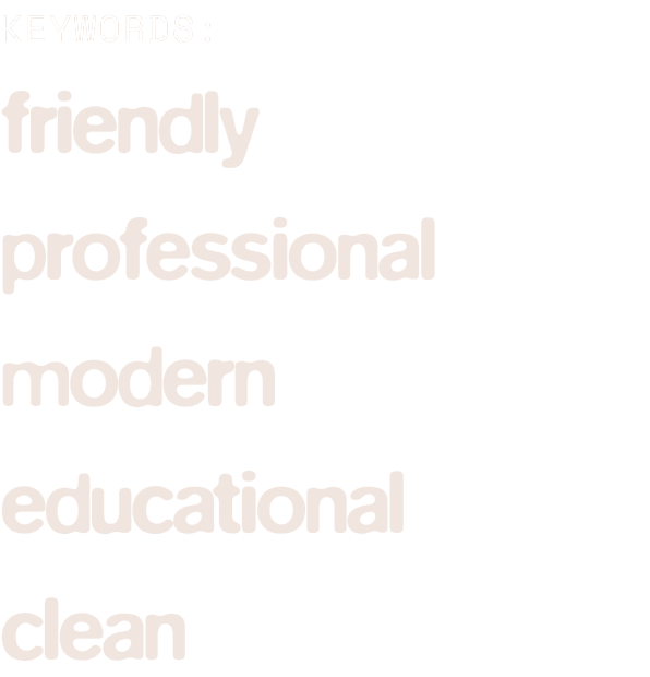
PROJECT SCOPE:
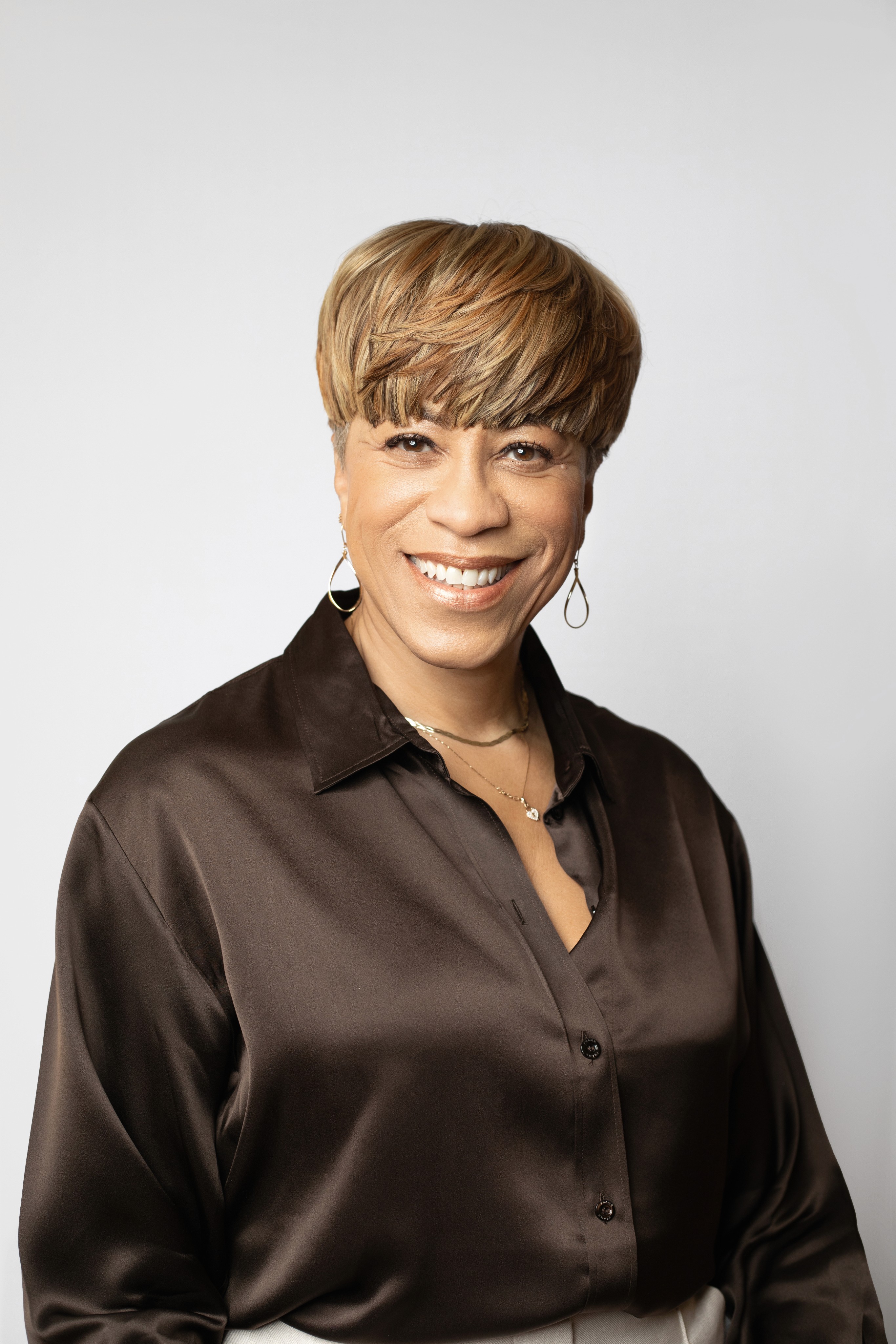
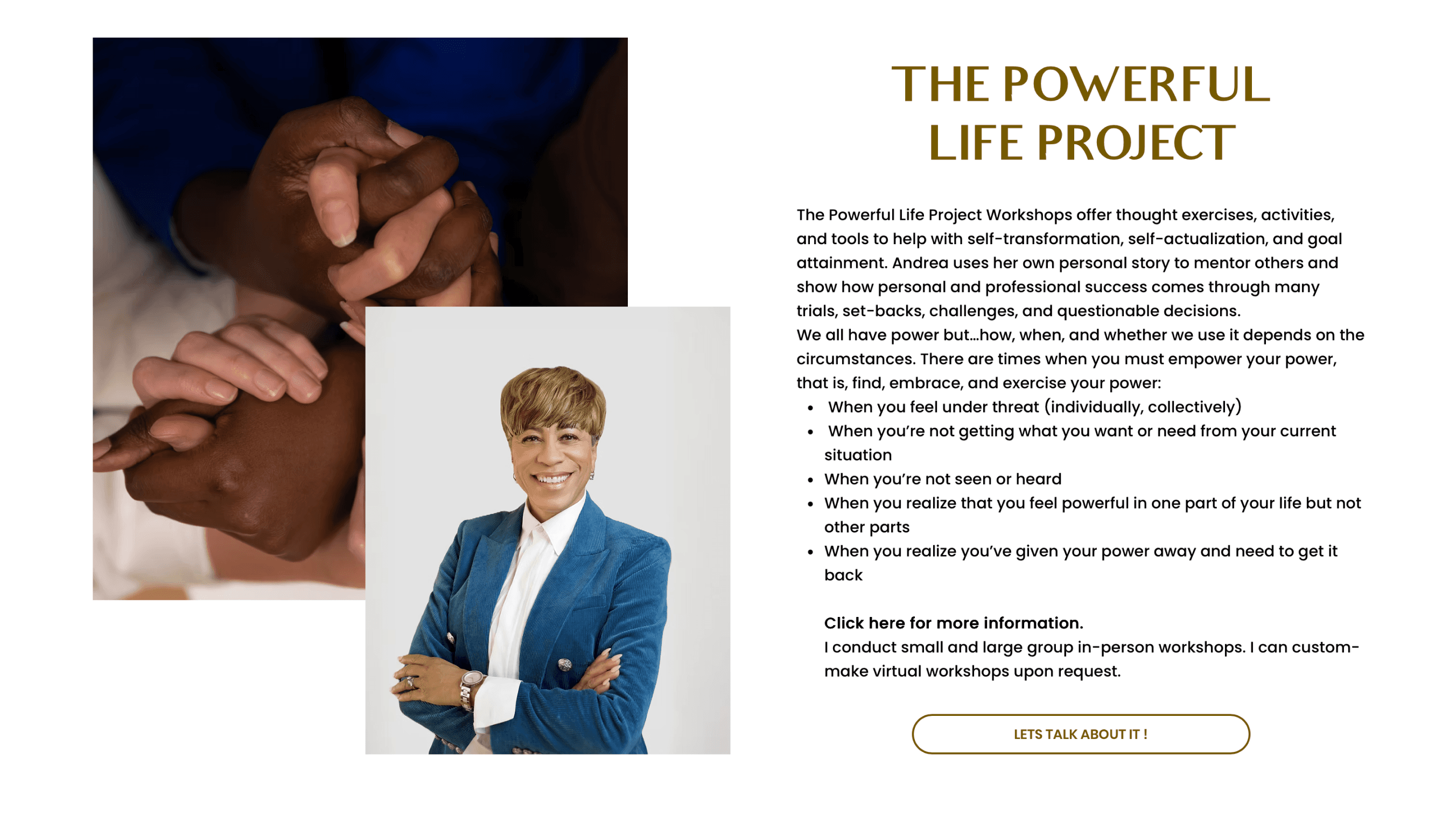
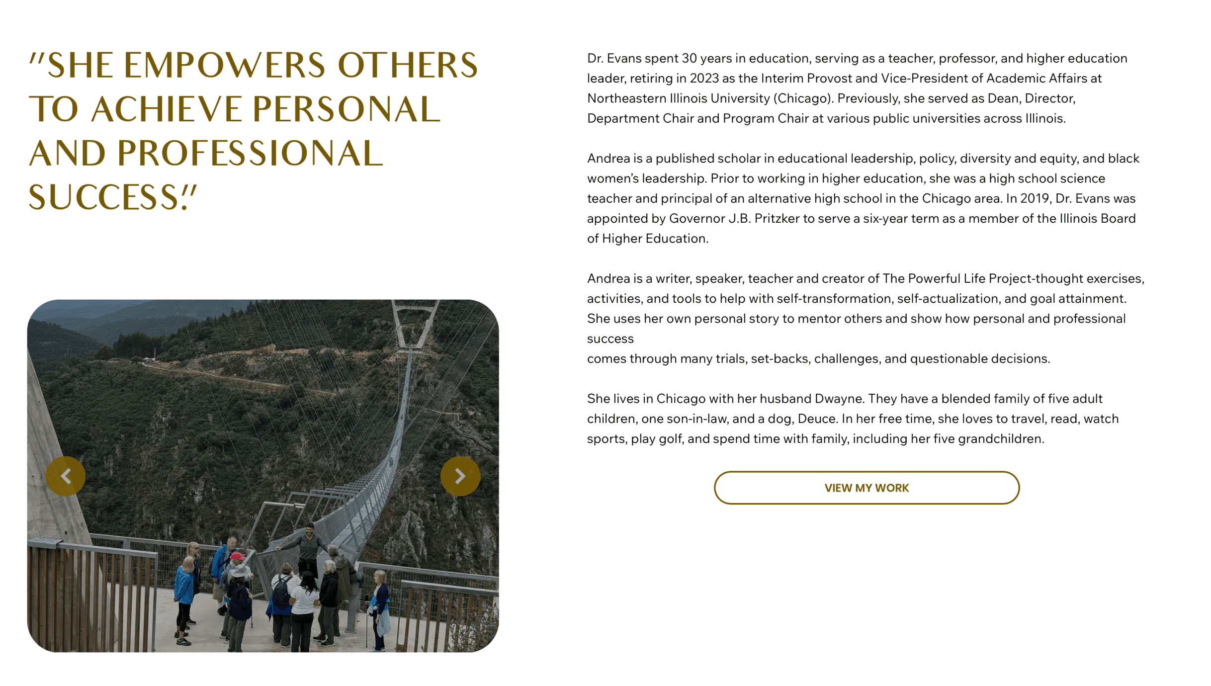
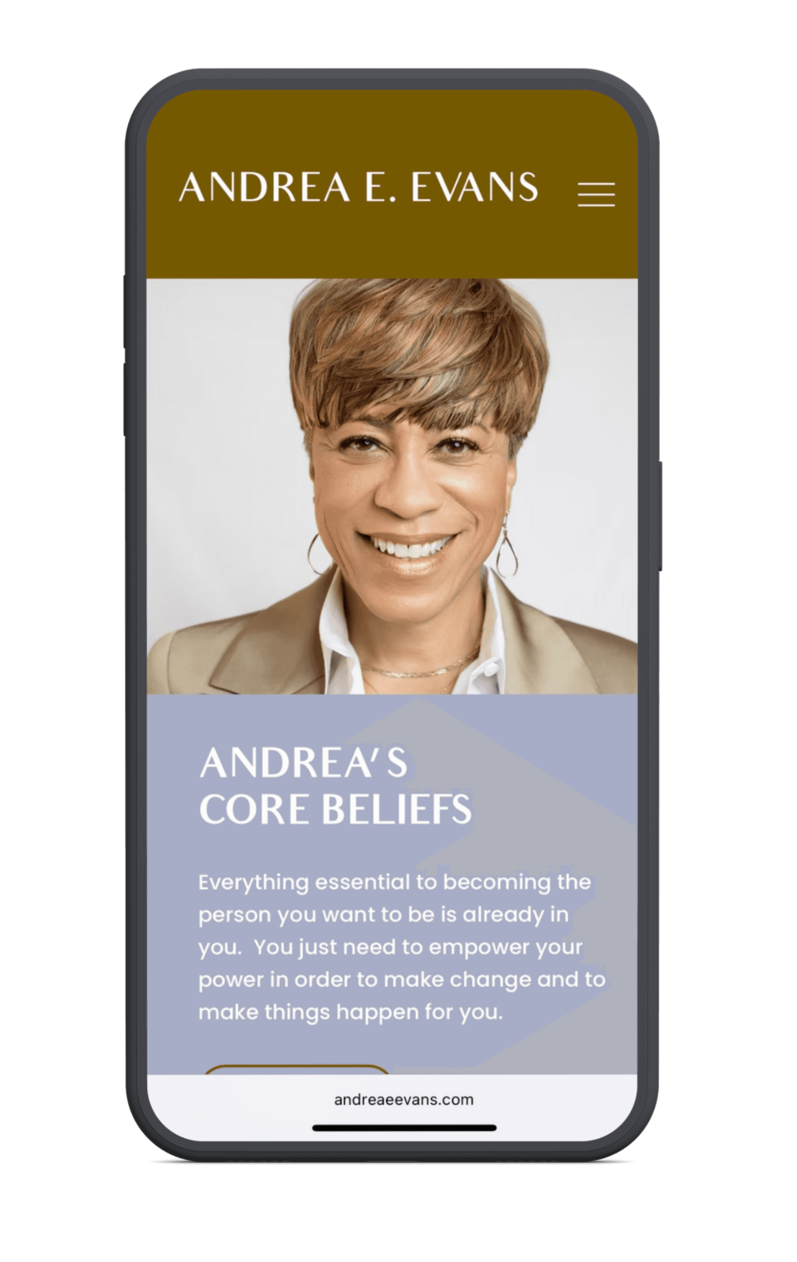
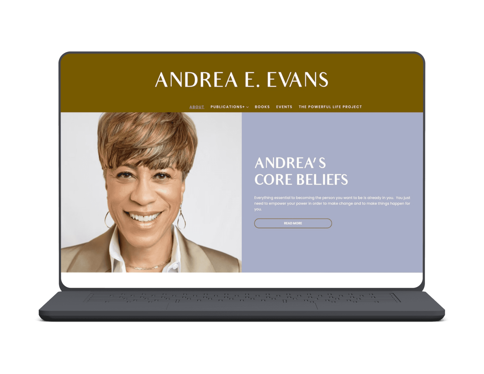
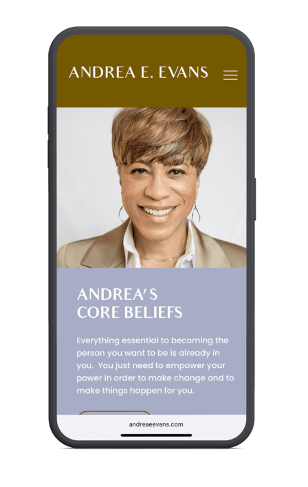
Andrea E. Evans, Ph.D. is a writer, speaker, educator, and founder of The Powerful Life Project — a platform dedicated to empowering others through self-examination, personal growth, and professional development. With a growing community, a podcast, published writings, and live events, Andrea needed one unified digital home that could hold it all while reflecting the warmth and authority she brings to everything she does.
EXECUTION:
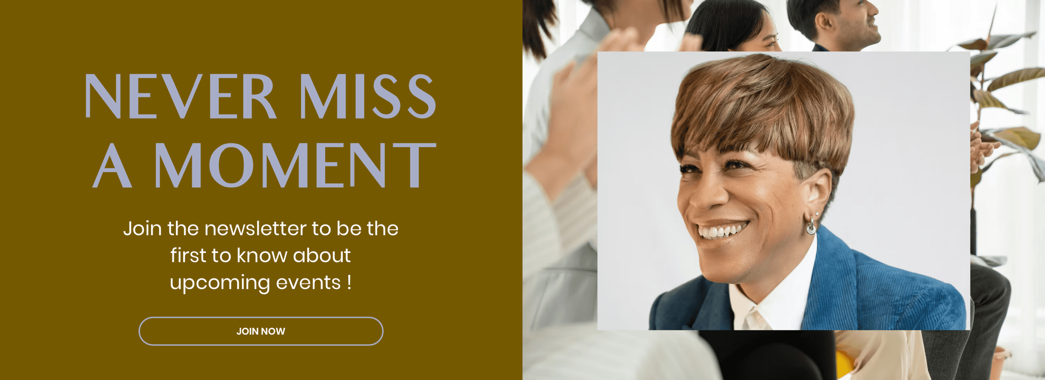
I designed in Figma and built Andrea's full website on Wix — creating a warm, modern digital home that brought every facet of her brand under one roof. From her blog and published writings to her podcast, upcoming events, and The Powerful Life Project community, every section was intentionally designed to feel connected and easy to navigate. The goal was simple — anyone landing on the site should immediately understand who Andrea is, what she stands for, and how to plug into her world. The olive and navy palette was chosen to balance authority with approachability, reflecting the tone Andrea brings to her community every day.


Contact
BEHANCE
SUBSTACK
Back to work
ANDREA EVANS
WEB DESIGN | web DEvelopment
PROJECT SCOPE:
Andrea E. Evans, Ph.D. is a writer, speaker, educator, and founder of The Powerful Life Project — a platform dedicated to empowering others through self-examination, personal growth, and professional development. With a growing community, a podcast, published writings, and live events, Andrea needed one unified digital home that could hold it all while reflecting the warmth and authority she brings to everything she does.
EXECUTION:
I designed in Figma and built Andrea's full website on Wix — creating a warm, modern digital home that brought every facet of her brand under one roof. From her blog and published writings to her podcast, upcoming events, and The Powerful Life Project community, every section was intentionally designed to feel connected and easy to navigate. The goal was simple — anyone landing on the site should immediately understand who Andrea is, what she stands for, and how to plug into her world. The olive and navy palette was chosen to balance authority with approachability, reflecting the tone Andrea brings to her community every day.

HOME
WORK
ABOUT
CONTACT